Google Review
Everything you need to look your best.
Logo & marks
A main mark plus the lockups, icons, and versions that look sharp at every size and on every surface.
Palette & type
Colors and type chosen to shine in the real world: on screens, on trucks, and in print.
Voice & messaging
How you sound, the line that sums you up, and the words that make people lean in.
Guidelines
A clear guide that keeps everything consistent for your team, your vendors, and anyone who builds with your brand next.
See the transformation.
Once your new identity is ready, the same team keeps building with it, so every graphic, page, and video stays on brand. That is what graphic design on subscription is for.
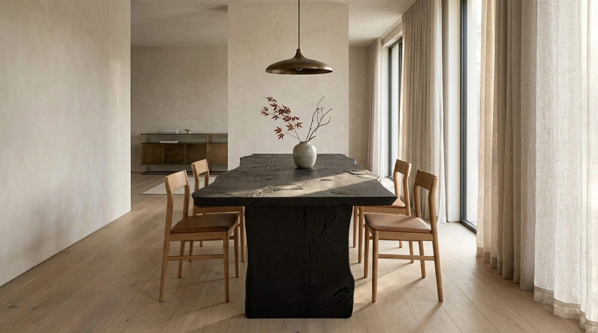
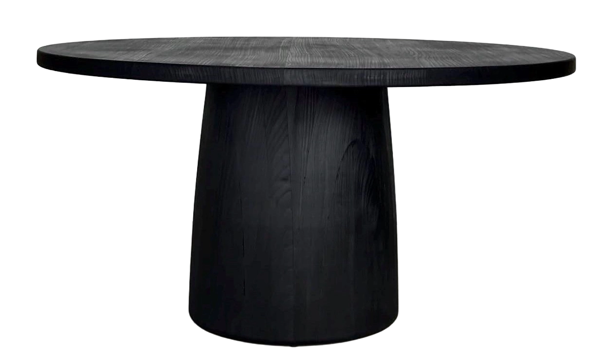
The Rustic Hut became ROHN Studio.
A Michigan furniture maker builds heirloom quality pieces, and now the brand shows it. We created the full identity, mark, palette, and type, then the art direction, photography, and website that bring it to life.

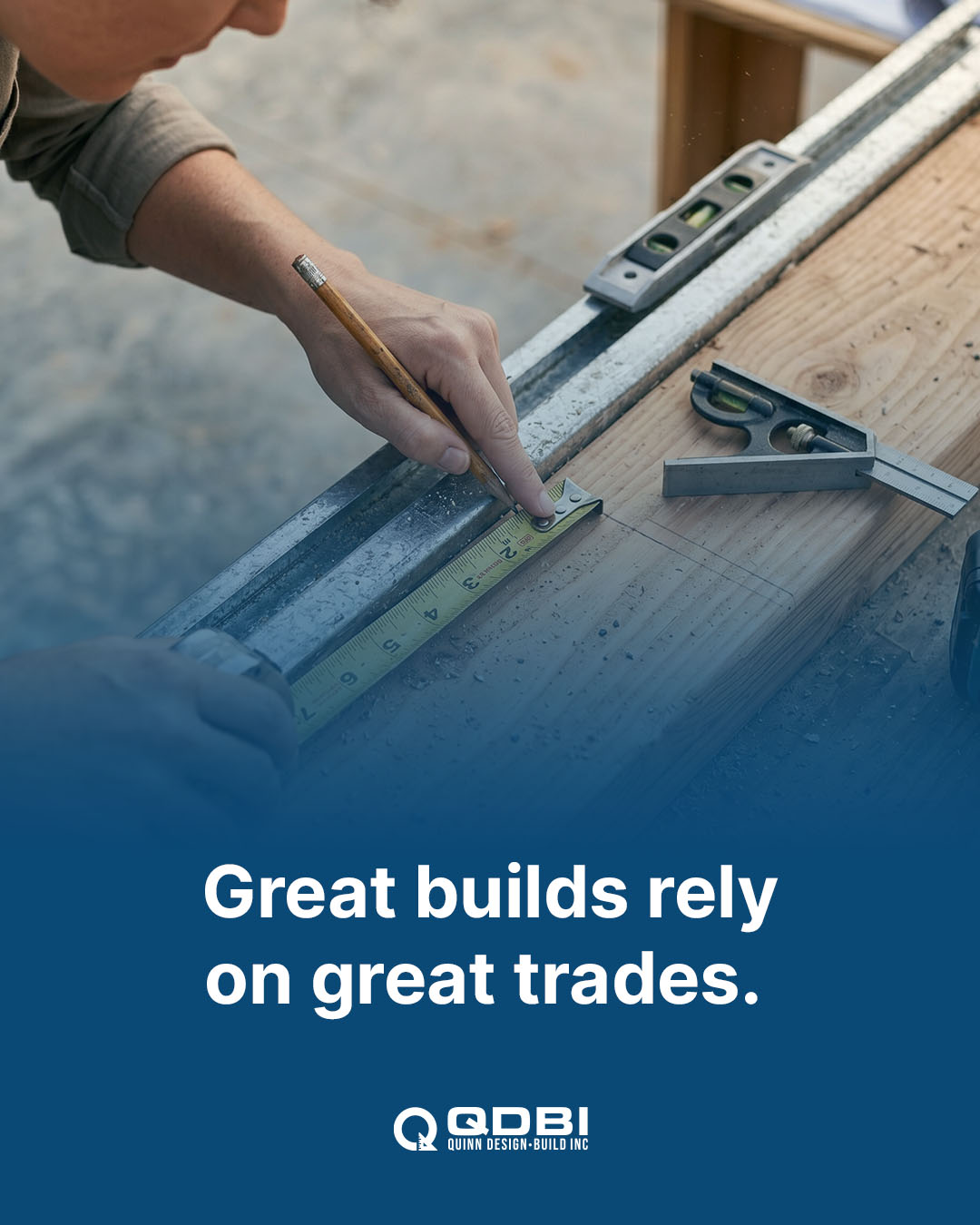
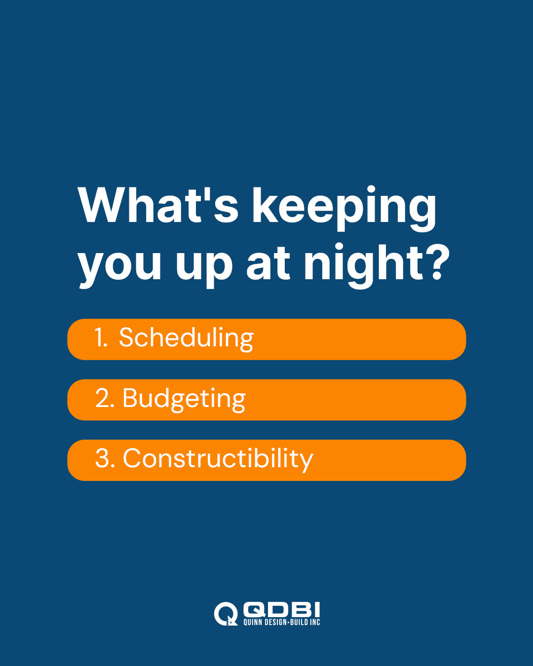
Schramm Construction became QDBI.
A trusted Fox Valley contractor with thirty years of great work relaunched as Quinn Design-Build, with a new mark, palette, and type, plus a social system that keeps the brand front and center.
Every brand that wins is built on story.
People choose the brand they understand fastest. So before we design anything, we get your story clear, using the fundamentals of Donald Miller's StoryBrand philosophy.
The idea is simple and powerful: your customer is the hero, and your brand is the guide. Every mark, color, and word we create helps you play that part well.

Adapted from Donald Miller's StoryBrand framework.